Introduction
If you’re reading this, you likely already have a logo. Perhaps you’re proud of it. Perhaps you’re not.
But here is the uncomfortable truth a logo alone can’t fix: if your marketing materials look like they were created by five different companies, you don’t have a weak logo. You have a weak brand.
A logo is a single tool. A brand is the entire workshop. It’s the complete, functioning system that allows you to build trust, communicate clearly, and scale your presence without losing your soul in the process.
The Single-Point Failure of a Logo-Only Approach
Relying solely on a logo is like having a brilliant opening line to a speech, followed by a rambling, incoherent story. It creates a jarring disconnect for your audience.
This isn’t an aesthetic failure; it’s a communications breakdown. Your audience subconsciously reads this inconsistency as operational inconsistency. If you can’t maintain a coherent visual language, how can you be trusted to deliver a coherent product or service?
The real cost isn’t a “bad look.” It’s diluted equity, wasted ad spend, and the silent erosion of credibility.
The Architecture of a Cohesive System
A true brand system is not a folder of templates. It is a strategic framework. It’s the underlying architecture that dictates how your brand behaves visually.
Think of it in three layers:
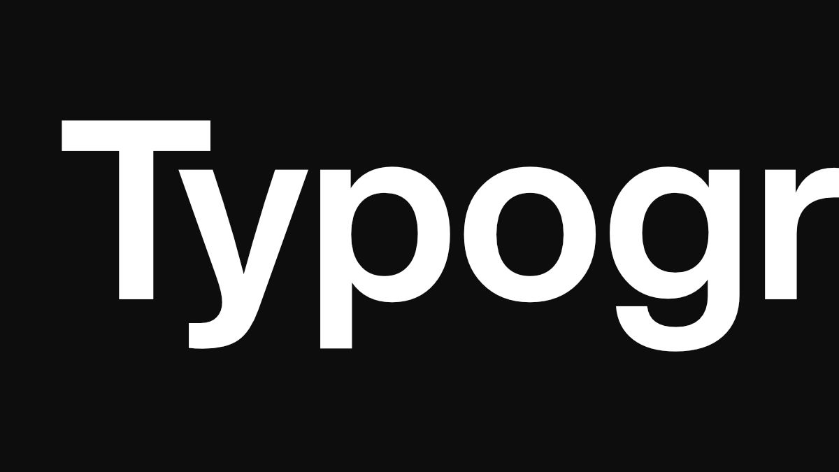
- The Structural Layer (Typography): This is the voice. The specific choice of typefaces and their application creates hierarchy, tone, and an unmistakable rhythm. This is where 90% of your communication lives. Get this wrong, and nothing else matters.
- The Environmental Layer (Color & Space): This is the mood and the atmosphere. It’s the intentional use of color, imagery, and white space that creates a distinct feeling and allows your content to breathe.
- The Symbolic Layer (The Mark): This is the signature. The logo. It is the final, recognizable seal on a communication that is already cohesive because of the first two layers.
When these layers are unified, every piece you create—from a slide deck to a social post—feels inherently, unquestionably like you.
Consistency is the Only Shortcut to Trust
In a noisy market, consistency is not a nice-to-have. It is a strategic weapon. It reduces cognitive load for your clients, making you easier to recognize, understand, and choose.
A robust system does more than make things “look nice.” It creates operational efficiency. It empowers your team to create on-brand materials quickly, without needing a designer to art-direct every single email. It turns visual identity from a recurring cost into a scalable asset.
This is the real investment: not in a set of static images, but in a dynamic, living system that protects your reputation and accelerates your growth.
Your brand is the entire conversation you have with the world. Make sure it’s saying the right thing.